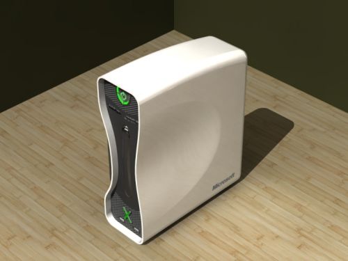
Microsoft X Console Concept Beats The Original
It takes truckloads of creativity to beat Microsoft at their own exemplary design and Miguel Duarte has exhibited just that with his Microsoft X Console concept. First impressions will certainly leave you starry-eyed; thanks to the radical curvy design that makes the original boxy product look amateurish. Yet, we choose not to go overboard with our praise, since we notice very few changes other than the exterior.
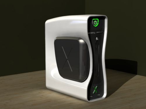
With a Sociology degree, one would have expected little out of Miguel Duarte, but it is quite clear that design acumen goes beyond the education one receives. In this case, it perhaps took just a few days (or more?) of nonlinear thinking and bingo, you have a better looking Xbox console. Some of the most conspicuous changes include a shift in the power switch and the prominent ‘X’ branding of the product (an aspect that was lacking in the original). We are looking forward to a market release, which is quite practical considering the ‘appeal factor’ of this concept.
As you ponder, you can also check out these cool futuristic console designs – the Xbox 720 and the Xbox 360 handheld.
